The 2016 Presidential election may still be more than 18 months away, but candidates on both sides of the aisle are already getting the ball rolling and declaring their intentions to run. Alongside formally announcing a presidential campaign comes the reveal of a logo—a mark that will exist on countless yard signs, bumper stickers, and campaign buttons (are those still a thing?)—all to let the world know that you support Candidate X…and their font choice. Logos and typeface selection are indeed defining elements for a candidate’s campaign. Their decision says a lot about their position and the audience that they are trying to reach, just like it would for any other brand.
While a logo on its own may not be the root cause to win you an election, it can certainly help; 2008 was a great example of this. McCain’s campaign logo featured a dimensional star (straight out of Wingdings?) and had a psudeo-militaristic feel—obviously aimed at an older, more conservative demographic. On the other hand, Obama’s iconic ‘O’ logo & poster design by Shepard Fairey and the use of Gotham (a typeface with clean lines and modern appeal) throughout his campaign resulted in a more contemporary feel, appealing to younger voters. And it showed in the polls. Obama garnished a resounding 66% of young adult voters (18–29) compared to McCain’s 30%. Now whether or this was really an election Gotham vs Optima is up for debate, but it helps to reinforce the idea that each typeface has its own personality and appeal.
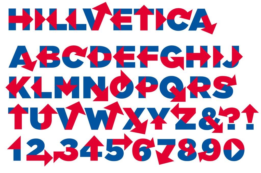
This year so far we have seen announcements from Hillary, Rand Paul, Marco Rubio, and Ted Cruz. As is the way of the internet today, all of their logos have faced some pretty fierce scrutiny and feedback; however, there are traits and elements found in each that speak to the demographic that they are each trying to reach. Hillary’s logo in particular has gotten some harsh criticism. It features a bold blue H with an equally bold, static, red arrow pointing to the right. Red, right…she is a Democratic candidate, right? There are some articles that have gone into a bit more depth with some designers even offering five-minute solutions to fix problematic elements for the mark set to define her campaign. Regardless of the debated details, she still opted for a clean, modernist, sans-serif type treatment á là Obama; an attempt to pick up those ever important younger voters. Marco Rubio seems to have gotten the hint, too…though I can’t help but feel sorry for Alaska and Hawaii. On the other hand, this is something that Ted Cruz overlooked, despite the “impressive” showing at his campaign announcement.
Brands, logos, and typefaces are defining elements at the forefront of any campaign. Going into 2016, it would seem necessary to begin treating these elements as living and breathing entities with distinct personalities that have the ability to allow a campaign and candidate to become more relatable to prospective voters. Hey, it may even win you an election.
See our recent work here. And don’t hesitate to reach out.