
Have you ever landed on a website or opened an app and felt confused about where to go next to complete your task? This is a result of bad user experience (UX) and can significantly affect a website’s conversions and a company’s bottom line.
When we are strategizing how to structure and design a website, it is essential to have the user top of mind. You should be meeting the specific needs of the user, so determining what all of those needs are is important. Taking that a step further, design is a key element in having good UX on your website. For example, you may have great content that meets the needs of your users, but if you design it in a way that is not adhering to UX standards, your website will suffer.
We have outlined some best tips and tricks to make sure you are following standards backed by research.
Knowledge transference = people transfer knowledge from other places on the web. This means you should place common things in common places—for example, a search bar in the upper right of the webpage or contact information in the footer of your site. There are plenty of opportunities for creativity, but we recommend not being creative at the expense of usability. Consistency is a good thing.
Users fixate on elements that are relevant to their task. For example, if users are searching a clothing website listing and want to know which shirts look the nicest, their focus will be on the photos. If they are interested in the lowest price, their focus will shift to the price.
There are a few key things you can do to ensure you are providing consistent information to allow users to easily find the information important to their needs.
The fold is the area on a page that is viewable on the screen without having to manipulate the page by scrolling, using arrow keys, adjusting screen size, etc. You should design with this in mind. It is important to place the most significant information at the top of the page and encourage users to scroll for additional content.
The homepage hero is your place to explain what the site will offer, but users will only scroll if there is a reason for them to do so. You may have important information past the hero, but without providing your users a reason to scroll, it can easily be missed. This is also known as a “false floor,” the design practice where the beautiful, large, full-width, mainstage hero appears to the user as the end of the page.
Try adjusting the size of that hero, and allow some of the intro content for the next section peek up. This will show the user that there is more down the page and encourage vertical scrolling. This is not just an issue on heros. It can happen anywhere on the site where you have a design element that appears to end the page, such as a thick line.
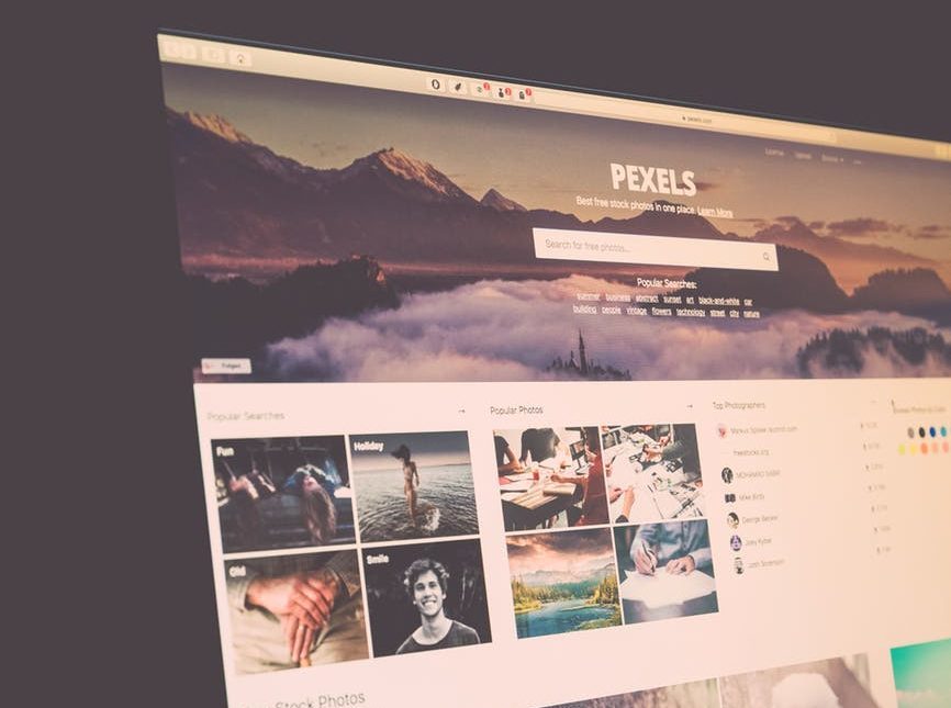
This website does a good job of cutting the fold – you can see the top of the row of photos indicating there is more down the page.
The aesthetic-usability effect is defined as “users’ tendency to perceive attractive products as more usable.” Unattractive things make users uneasy. Users are not sure why, but when they land on your site, they feel unsure of where to go and what to do, so they will leave. There are design standards, such as size of buttons and hierarchy consistency, that help ensure your website is attractive to users.
Balance is a key component in achieving a well- done and polished design. Imbalance is a main trigger that creates discomfort in your users, so keeping visual weight in mind will help achieve balance. The following are all important components of visual weight:
These are by no means all of the UX standards that exist, but this is a good list to keep in mind while creating or reviewing designs.