It probably comes as no surprise that the number of people using mobile devices has increased drastically in recent years. But the way this affects your business, and ultimately your bottom line, is where things get real.
Check out the infographic below for some awesome stats on all things mobile. Staying ahead of the curve on this one is essential – as in “increased sales and a lot more traffic” essential.
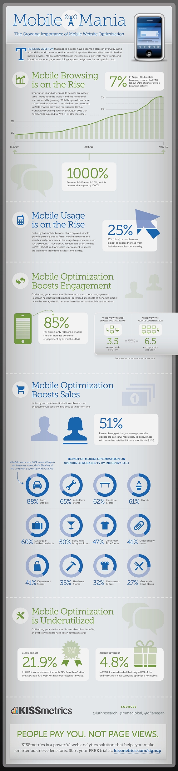
Source: The Growing Importance of Mobile Website Optimization Infographic
The first thing you need to consider before optimizing your site for mobile is how the behavior of mobile users will differ from desktop users when it comes to your site. For example, check out how Ruby Tuesday‘s website differs from their mobile site (image below). They have taken into account what users will be using the mobile site for and organized it wisely. The large buttons and simplicity make the site much less daunting than if you were to pull up the full website on a tiny mobile screen and be forced to constantly scroll and zoom.
Looking to optimize your website for mobile? Shoot us an email – we would love to help!