Plexus Recycling Technologies
Brand DevelopmentTHE CHALLENGE
Plexus Recycling Technologies hired AOR to develop a name and brand for the company. AOR was charged with executing a new identity for the company to allow them to stand out within their industry as leaders who bring innovative solutions to the market. The Plexus team brings together several product lines that are not traditionally represented by a parent company. Our main challenge was to work with each entity—to hear each voice—and ensure the overarching brand was equally unique while being representative of the individual product lines.
THE EXECUTION
Our first task in establishing a new brand for our client included a great deal of research—learning about the various product lines, their position within the marketplace, and understanding their target audiences. In order to dive straight into naming, messaging and comprehensive web design/development, we needed to ensure our work was rooted in strategy.
THE PROCESS
AOR engaged the company’s key stakeholders in a full discovery, naming and branding exercise. This half-day session allowed us to gather key insights about their company goals, who they wanted to be, and how they wanted to present themselves. Through a series of various exercises, we were inspired to start creating the words and visuals that would ultimately become their new brand.
We worked collaboratively with the stakeholders to establish the new company’s name. After an intense research phase and naming exercise, the client selected “Plexus” to represent their role as the central, guiding figure in bringing various product lines together.
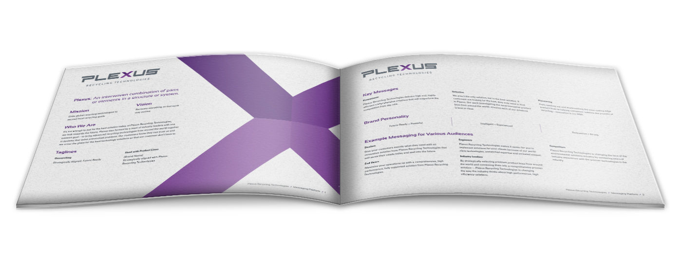
Working in tandem with the name development process, we also created a robust messaging platform for Plexus. This living document now serves as the “true north” for their brand — informing every piece of content or collateral they create. The messaging platform includes everything from their mission and vision to a brand personality and specific target audience messaging.
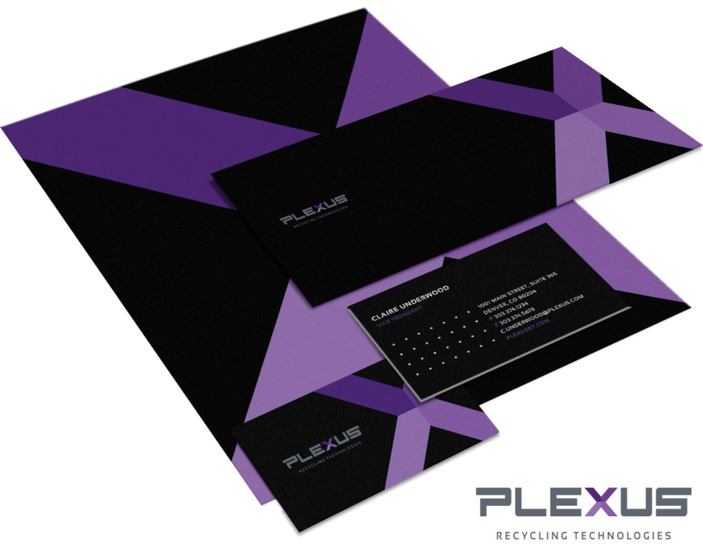
With a messaging platform in place, AOR moved into the visual brand identity. We essentially used the approved messaging platform as an in-depth creative brief for our design team. They were charged with creating a brand logo, color palette, selecting brand fonts, and creating any unique design elements. After a series of logo iterations, the client selected the current logo in use for it’s sleek, yet strong connotation. The final color palette was created and selected for several reasons: it is extremely unique in the market; it feels modern and forward thinking; the royal purple denotes a sign of superiority—which is how they want to be viewed in the industry.
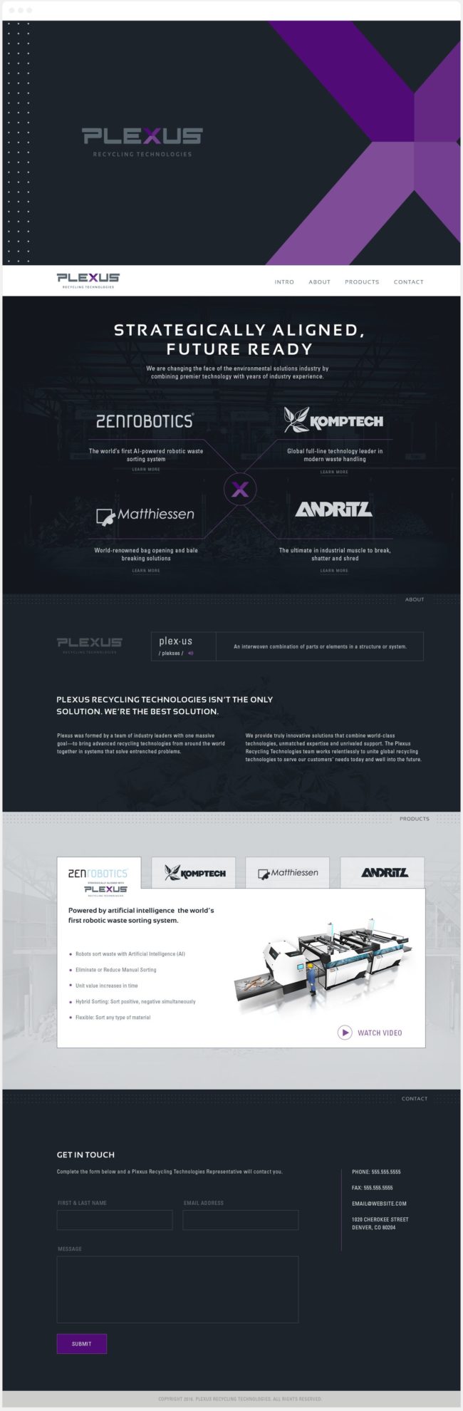
We then developed a comprehensive brand guide for the client to use in-house and for our Interactive team to use for website design inspiration. The client needed a live site in time for an upcoming industry trade show, so we executed a sleek, single page site in a very accelerated timeline. We leveraged modern functionality on the site, while communicating the brand’s value proposition and various product lines.