Colorado Counties, Inc.
Rebrand & Website DevelopmentIndustries
Counties, Commissioners, and a Century of Credibility
Colorado Counties Inc. (CCI) isn’t just another government association — it’s the voice for all of Colorado’s 64 counties. With over 120 years of history, they’ve earned a rep as the trusted Sherpa for county commissioners, providing education, a chance to connect, and support when navigating policy and legislation.
CCI’s team came to us at a turning point. They were ready to move on from their outdated look and to formalize a narrative identity that would serve them well as they continued to serve our state.

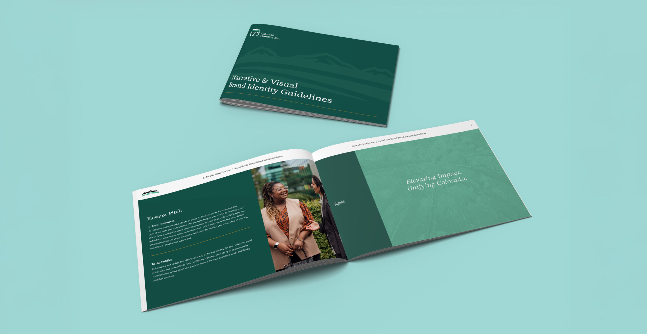
Balancing History with a Refreshed Look and Clear Narrative
Our mission was to bring the brand into the 21st century while still respecting the organization’s legacy (no radical visual rebrands or neon color palettes, for example). Narratively, we had to create a brand voice that maintained the formal and informative tone their audiences were looking for without skewing overly dry and faceless. We had to walk the line between credible and clear, cutting the jargon while keeping the gravitas.
From ‘Faceless’ to Familiar
We began with a new narrative identity, we weighed messaging that conveyed strength and simplicity, leaning on a clear, action-oriented vocabulary that celebrated the efforts of the organization and its members. The shift allowed CCI to show more personality, highlight their people, and turn their brand from anonymous authority to approachable expert.
Designing with Diplomacy
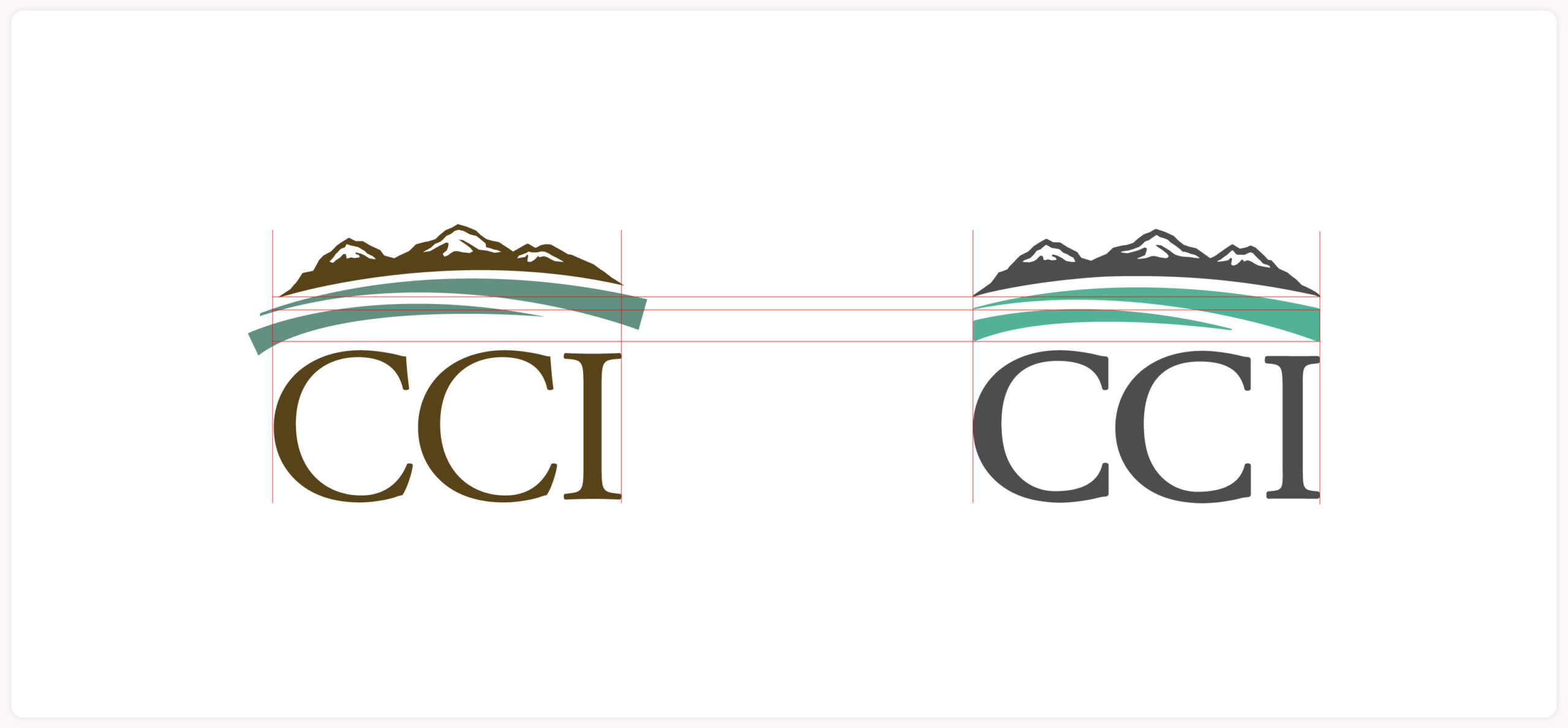
Over the years, CCI’s members and audiences had become attached to their existing logo. That meant that any visual updates had to strike a balance between familiarity and freshness — feeling professional and future-facing without sparking a full-on identity crisis. We leaned into CCI’s heritage, plains and peaks included, while ditching the dated tones and rigid layout styles.

We started by rebalancing the plains and mountains in the logo, and then created clean cuts on the plains to align them with the main letterforms. A more contemporary serif font was used, and typography was then thickened for easier legibility. Finally, the brown shade was replaced with gray and brightened with teal, fully modernizing and refreshing their visual brand.

CCI also had internal programs with their own logos. To refresh them, we incorporated a hand-lettered typographic feel for approachability and introduced a new color palette that drew inspiration from Colorado’s colorful landscape to breathe new life into the brand.

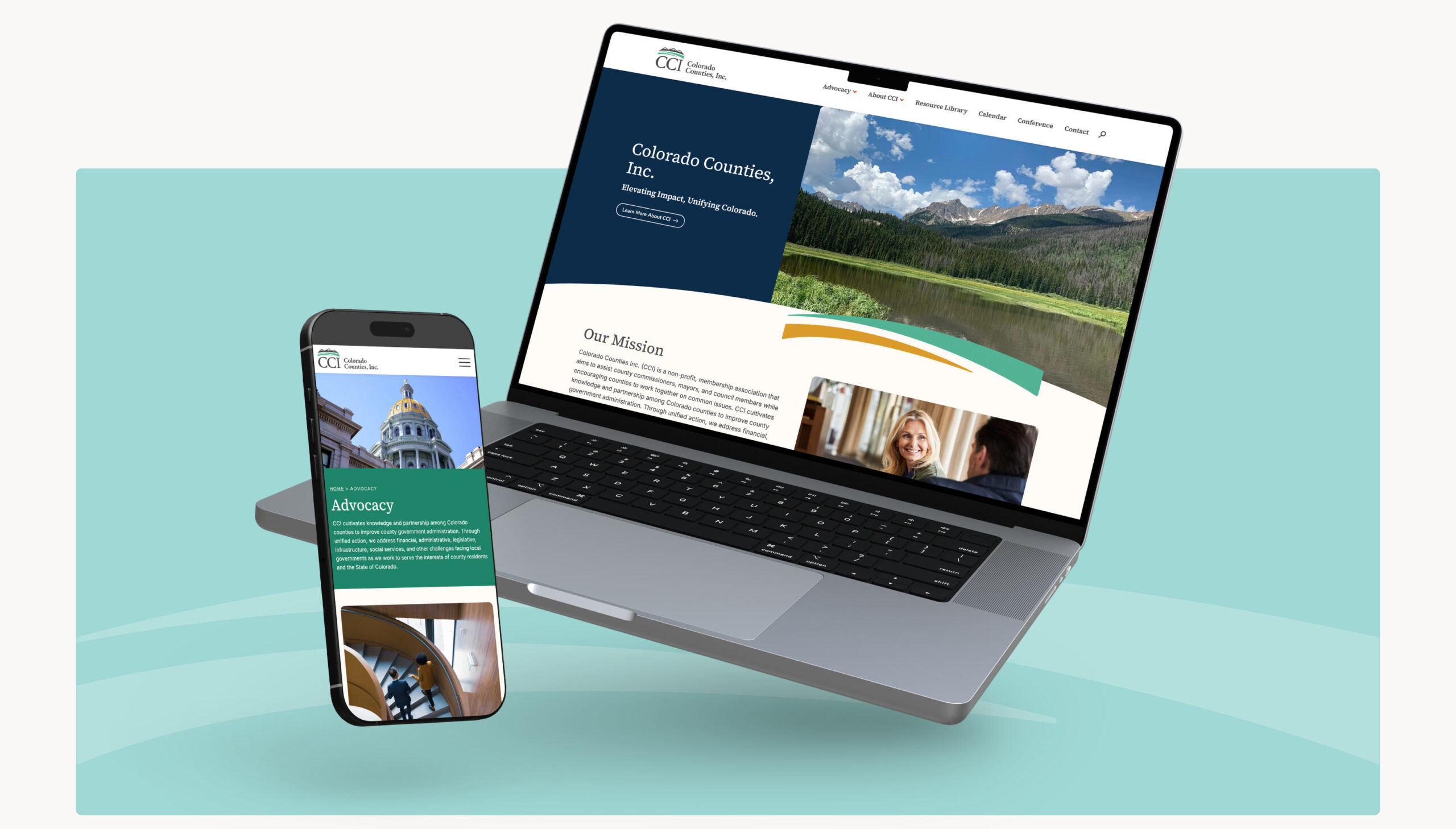
Bringing the New Brand Online
CCI’s website was less helpful resource and more digital haystack. Members struggled to find policy positions, meeting schedules, or white papers without playing ‘Where’s Waldo’ with the navigation. A top priority? Make everything findable, downloadable, and shareable.
Following the modernized refresh of the brand, the website underwent a similar refresh. Big picture, we made all the content clear and concise across every page. We also simplified components such as the calendar, resource library, and corporate partner information to make everything easy to find and use. The homepage was restructured to showcase CCI’s unique value and navigation was heavily streamlined for ease of use (hello search function!).
Becoming a Policy Powerhouse
CCI didn’t just want to keep up — they wanted to lead. By rebuilding their narrative identity, refreshing their visuals, and building a better site, we helped them show up smarter, faster, and friendlier. By pairing their grassroots leadership model with a more modern face, they’re proving that trust and transformation don’t have to be opposites as they tackle their mission of becoming a go-to resource for smart policy takes and commissioner guidance with renewed fervor.
Decrease in Sitemap Size
Increase in Site Performance
Increase in Site Health
New Google SERP Featured Keywords