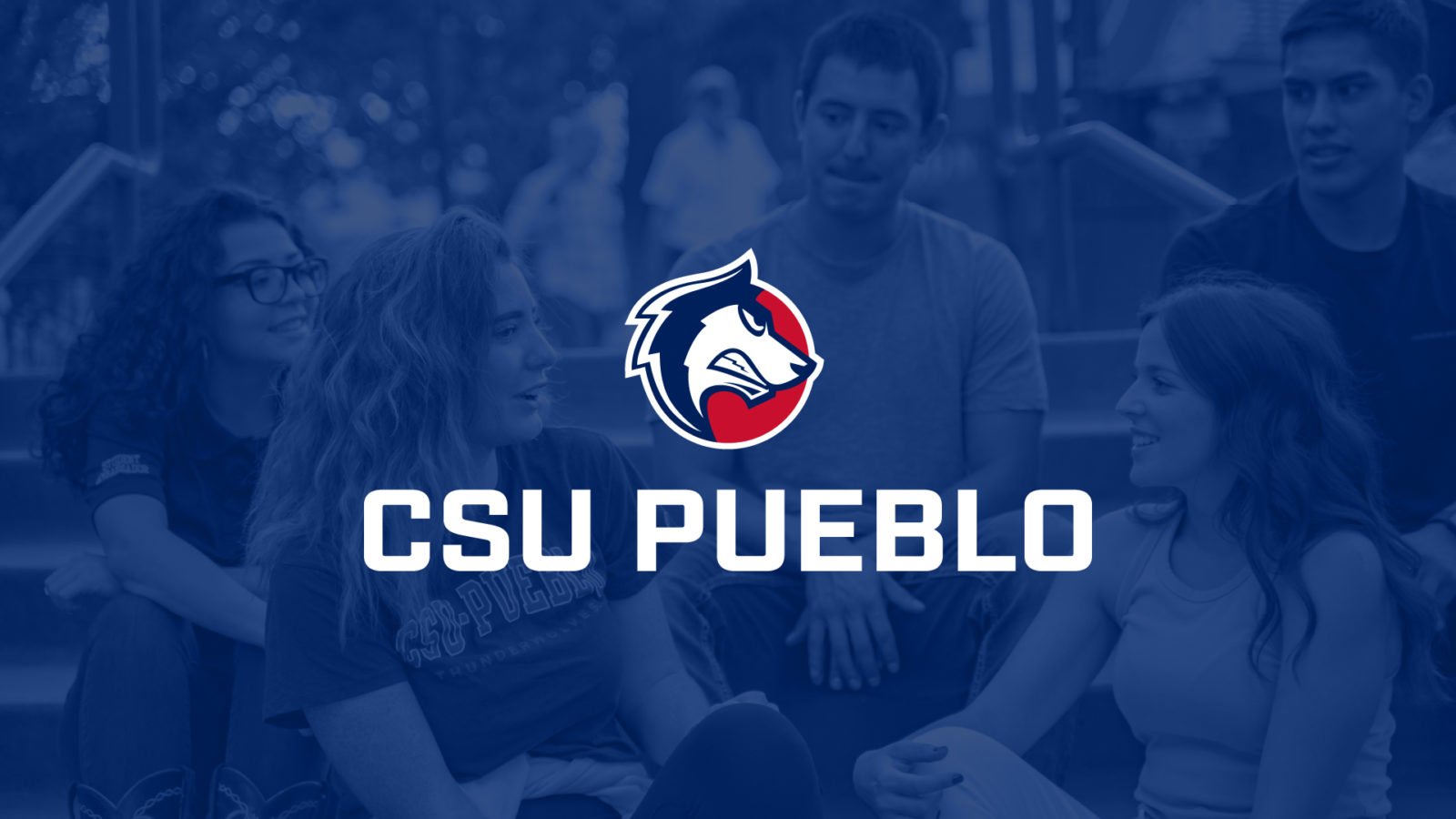
Colorado State University Pueblo
Brand IdentityIndustries
Solutions
When a Vision Meets Opportunity
In 2018, Colorado State University (CSU) Pueblo kicked off ‘Vision 2028’ — a campaign that aimed to establish the school as “the people’s university of the Southwest United States by 2028”. Vision 2028 introduced a new mission for the university and the school’s leadership saw an opportunity to create an entirely new personality for CSU Pueblo.
Greater Challenge. Greater Opportunity.
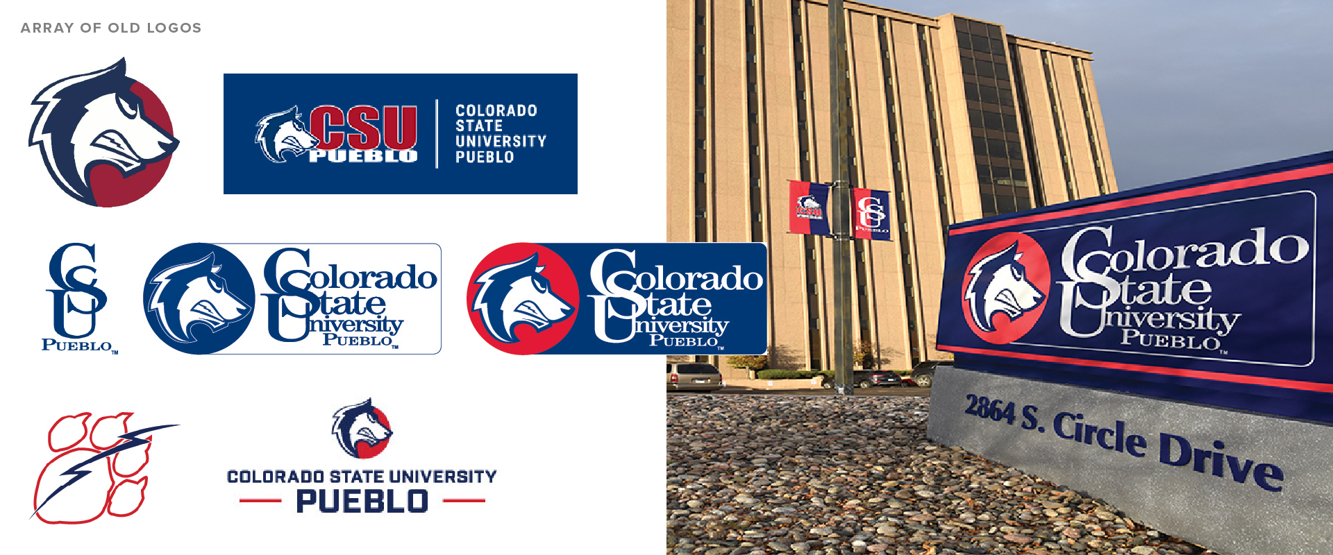
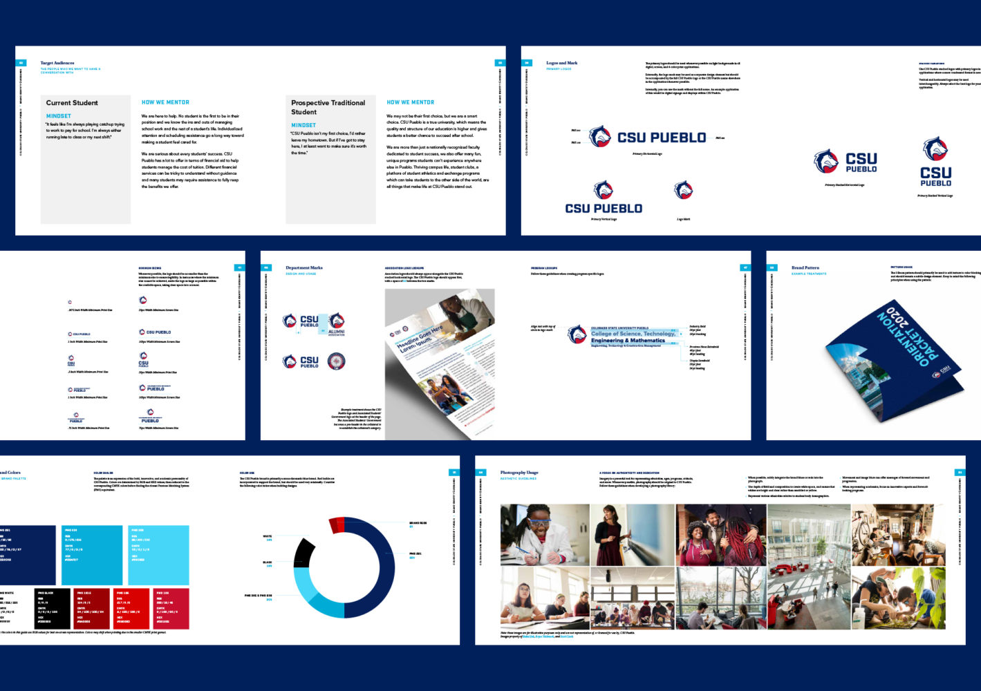
As AOR took on the challenge of reinventing the school’s brand identity, we encountered a unique obstacle: many of the myriad departments, sports teams, and organizations on campus had, over time, created their own logos with no set guidelines or rules on how to use them. Not only did we have to drill into the essence of CSU Pueblo as it related to Vision 2028, but it was paramount that the new visual brand be centered on cohesion, consistency, and ease of use.
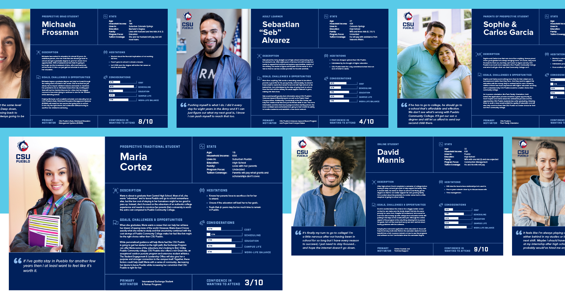
Getting to Know Our Audiences
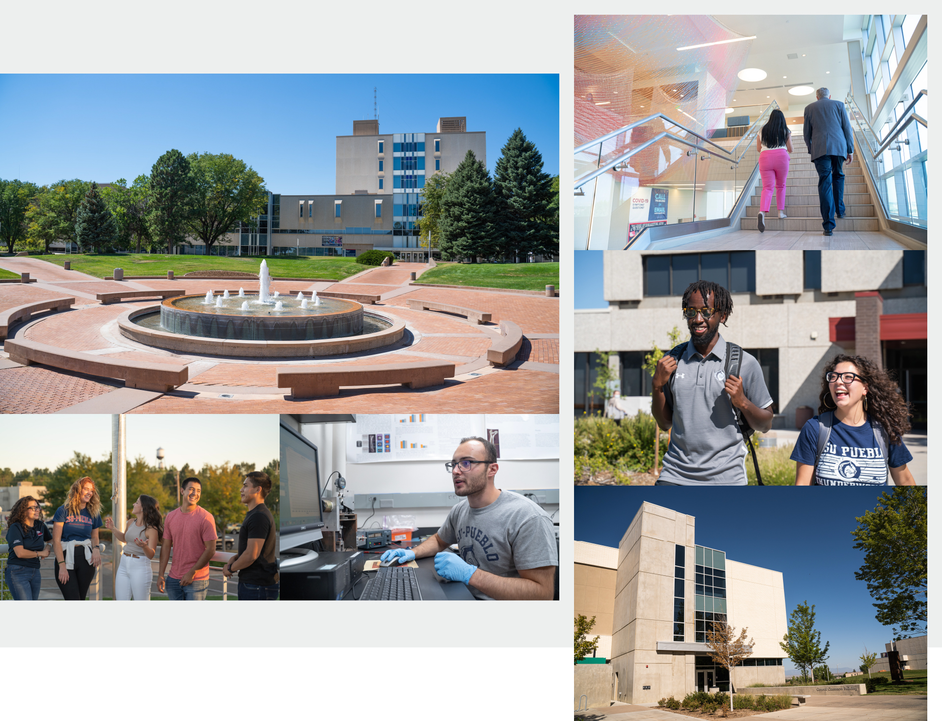
Everyone deserves to feel proud of the school they attend, which makes reinventing a school with a student body of nearly 4,000 and a faculty of over 300 no easy feat. Especially when they all span an enormous range of ages, backgrounds, degrees, and learning modalities. To better understand our audience, we began by diving into the demographics and psychographics of the students themselves, creating personas for seven key groups that were used to structure and guide brand messaging. After the research stage, we were able to identify what students and faculty were looking for in their school’s brand and created a new visual identity and messaging platform for the school.
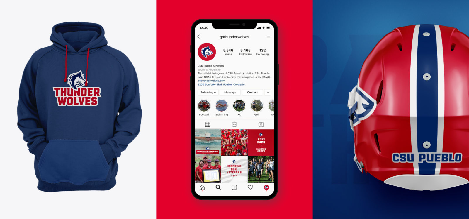
Organizing the Chaos
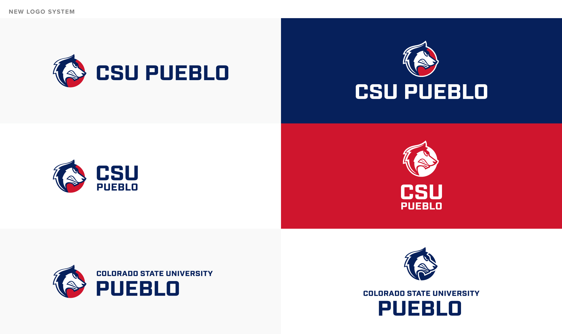
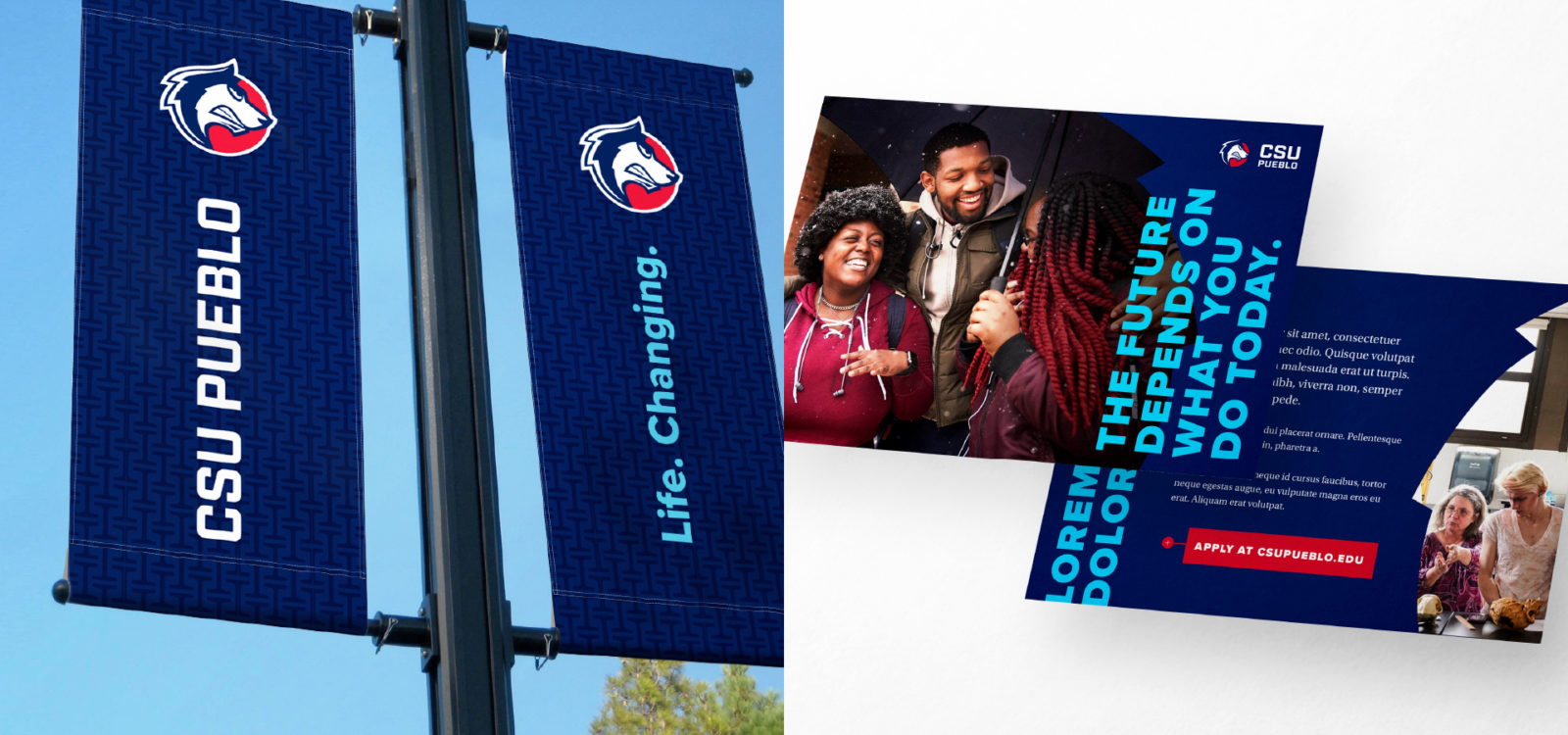
As part of the visual brand identity, the AOR team expanded the university’s color scheme for increased flexibility and revised their photography style to be more human-centered and representative of the school’s students, faculty, and community.
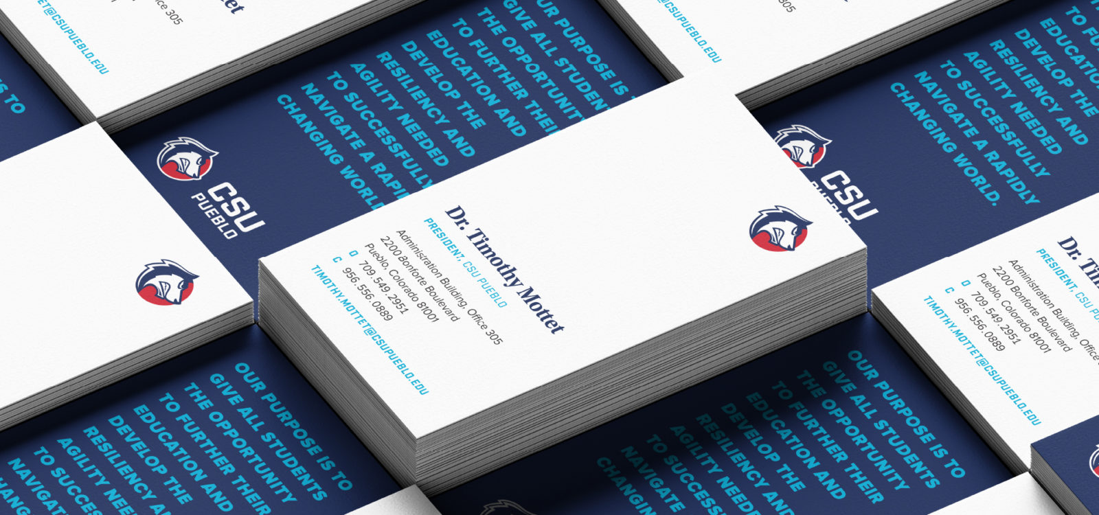
In pursuit of cohesion, unity, and above all, simplicity, we created an in-depth design system and brand guide that anchor everything from the school’s logos to mission to values to brand voice in one place. The incorporation of the new messaging platform and revised visual brand help to set a solid and consistent foundation for all communications, both internal and external, moving forward.

Making Vision a Reality
Despite a global pandemic, the rebrand was successfully completed on time and rolled out across every department at CSU Pueblo. Perfectly aligned with the school’s ethos and Vision 2028 goal, the new brand is poised to infuse the school with new life and higher enrollment for years to come.
One Brand. One Thousand Uses.
The personas that were created to guide messaging were translated into tools that school faculty now use to help understand different students’ motivations and obstacles. The new visual brand and subsequent design system truly permeated through every corner of campus — from school-wide branding to individual emblems for all 22 sports teams, AOR provided over one thousand updated logos across different color spaces and formats to be used in every conceivable manner.
Last but not least, the new brand laid the groundwork for CSU Pueblo’s new campaign ‘Life. Changing.’ which you can check out here.