
PartUs
Brand DevelopmentSolutions
PartUs was created to help streamline the traditionally complicated and emotional process of divorce. By providing a centralized platform in which attorneys, clients, judges, and other individuals involved in the divorce process can upload, access and share information, PartUs aims to empower clients and facilitate a better outcome for all parties.
THE CHALLENGE
Every startup has potential for success but ultimately face the struggles of overcoming competition, growth and market challenges to create a name for themselves in their field.
Our clients at PartUs were no different. They came to AOR in the ideation phase. They had no identity just an idea. AOR was tasked with learning all that we can about the direction for what the company and online platform would become to develop a name, messaging platform and full brand identity for them.
THE APPROACH
The PartUs team is located in North Dakota allowing AOR to work with them solely on a remote basis. We were able to execute a discovery session to gather all the information required to build an educated naming process for the startup.
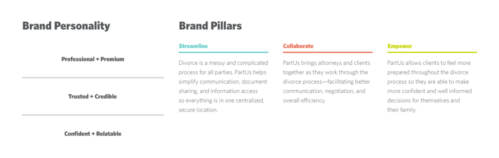
PartUs takes two typically opposing terms, “Part” and “Us”, and fuses them together to create a distinct and surprisingly optimistic idea. At its core, PartUs represents a common ground from which all parties involved can work toward a less intimidating and more cooperative experience.
Once we had solidified a name, the identity of the brand really came to life.
THE PROCESS
AOR built a strong messaging platform for PartUs to stand on. It was one of the most important pieces to get the company up and running. The messaging platform gave the PartUs team language to leverage so that they could begin communicating to their target audiences in a cohesive manner to begin creating excitement for the company.
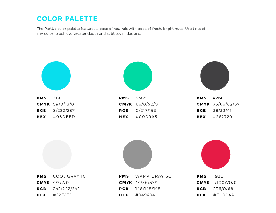
Once the name and messaging platform was in place we began work on the graphic identity including logo development and all visual brand elements. The strategy behind the logo was to break the words “Part” and “Us” with a brand mark that could stand alone to symbolize two entities coming together to move apart. We leveraged a friendly and approachable color palette to evoke a calming feeling to the difficult topic.
THE OUTCOME
The client was thrilled with the process as a whole. They are leveraging all elements to build out their online application and beginning to share with industry professionals with great response. Happy clients is what makes AOR tick.