
Welcome to the final installment of our four-part Digital Accessibility Insight series!
Clearly, we think digital accessibility is important…because it is. We’ve talked on and on about the current state of digital accessibility, where it’s going next, and most importantly, what it is.
If you haven’t already, we suggest you go back and read the other posts in the series, it’s there you’ll learn everything you need to understand the following examples.
It’s one thing to know exactly what makes a webpage or digital marketing collateral accessible, and it’s another to actually see it in action and successfully implement it in your project.
At AOR, we don’t just talk the talk, we code the code. Below you’ll find a number of examples of our web work. Each website was designed and developed to be fully accessible — from both our end as well as the clients’. For each of the following clients, we’ll highlight just one aspect of digital accessibility present on the site.
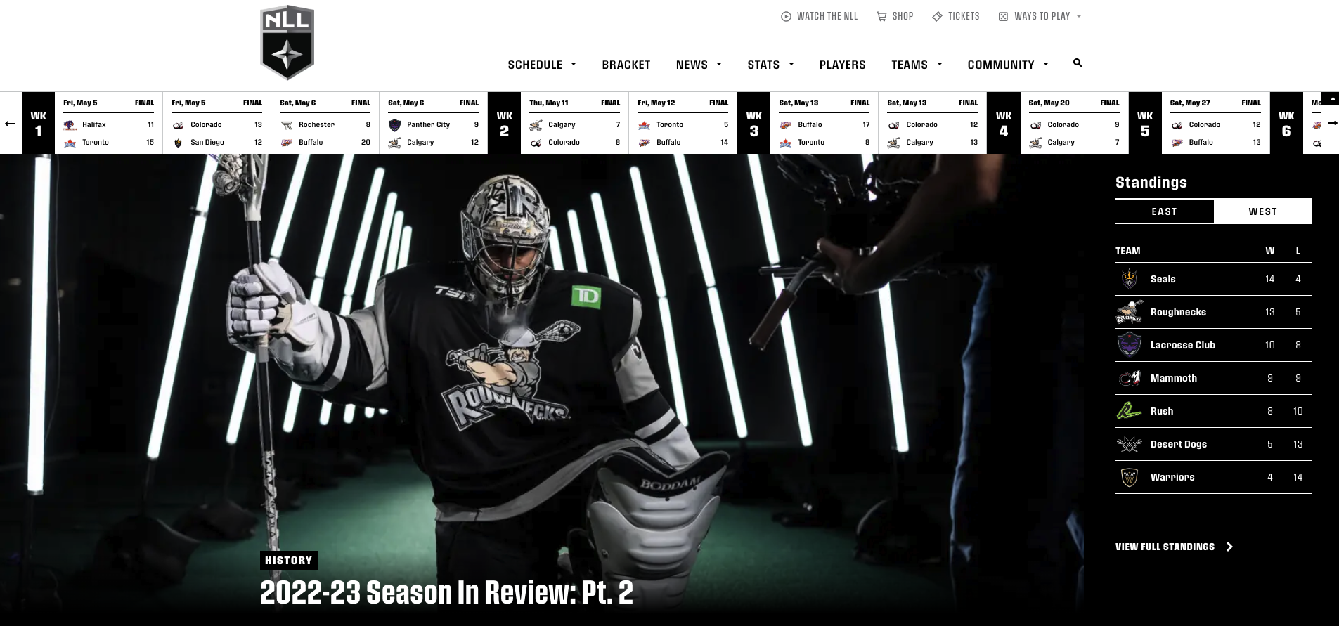
National Lacrosse League: Clear Navigation
Website Design & Development
Growth is good. But when you grow so much so fast, it’s important to keep up with the growth in all aspects of your business. The National Lacrosse League (NLL) came to us for some help making their website fit the expansive fan base they had developed over the years.
User experience was at the forefront of our design and development process, it was important we took into consideration ALL fans and made the website digitally accessible. When fans come to the NLL site, they are usually looking for specific information about the schedule, specific teams, or other stat information. We had to ensure the navigation was clear, easy to use, easy to read, and detailed. Not only will a clear navigation help users in general, but the intention is to be digitally accessible and ensure all users, including those with cognitive disabilities, can easily understand where they are trying to go. The fewer clicks to get to what you want to see, the better, which is why we also include real-time game statistics right below the navigation on the homepage.
Additionally, backend code is included in all AOR websites to ensure the navigation is easily read using a screen reader or keyboard.
‘The Long Story Short’ is our monthly newsletter highlighting everything from our agency’s latest work to industry happenings at large. Don’t miss out, sign up in the form below!
Sage Hospitality: Alt Tags
Website Design & Development
Sage Hospitality had recently gone through a large company restructuring and brand refresh, and they came to AOR looking to bring the brand through to their website.
Since Sage is a hospitality company, they rely heavily on beautiful images of both their spaces and their culture. People go to their website to view their award-winning work and innovative, modeern interior and exterior designs of hotels and restaurants. So what happens if someone with visual impairment wants to understand the breadth of Sage’s work? Alt tags. As you can see here, the alternative text provides a detailed description of the image for those with visual impairments. It allows for an equal experience and understanding of the content on the pages.

Here is the code for the image of the couple in the hammock:
“<img
src=”https://www.sagehospitalitygroup.com/wp-
content/uploads/2020/07/Bordwin_PerryLane_5186-
2.jpg” alt=”Two People in rooftop hammock”>”
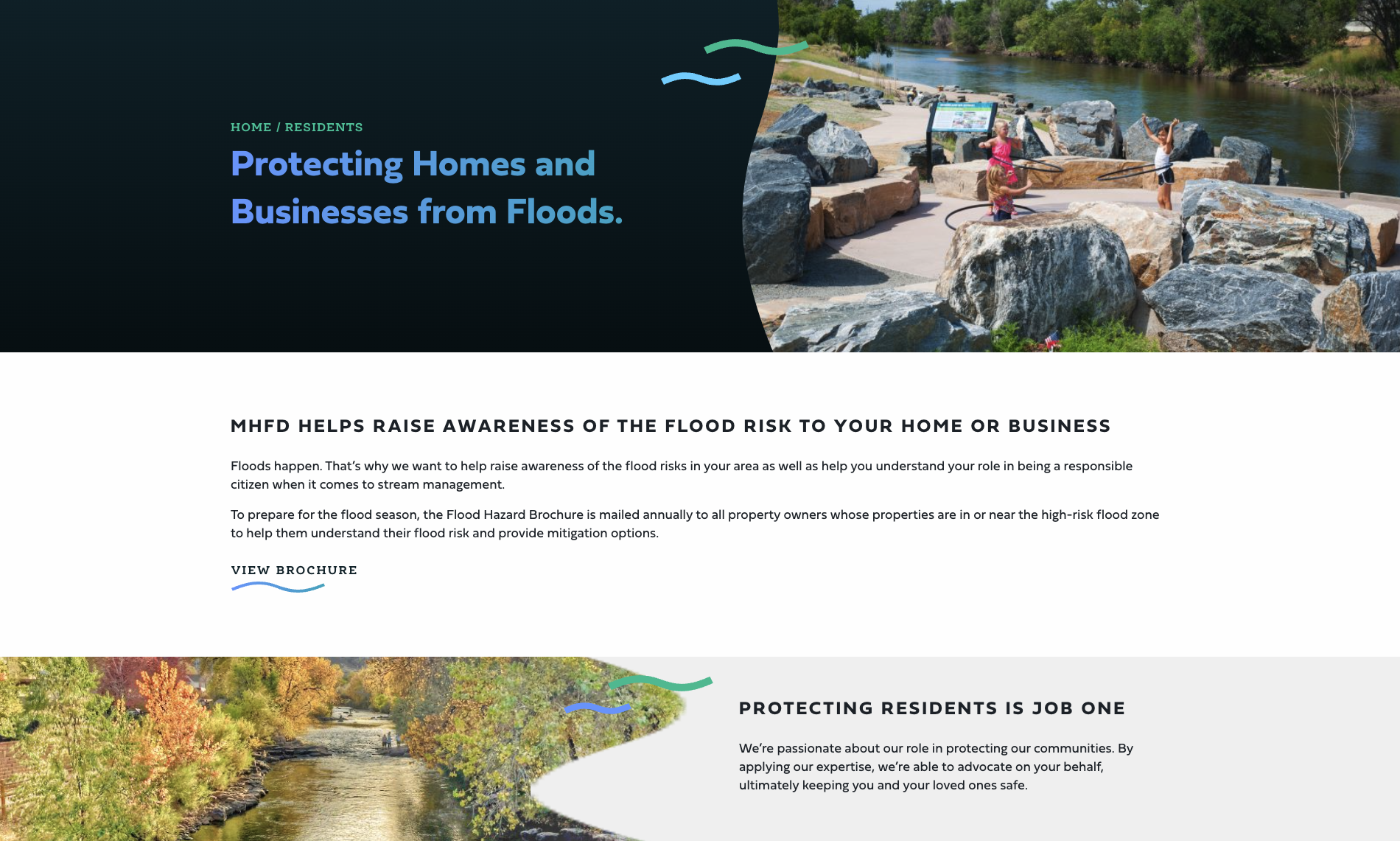
Mile High Flood District: Content Structure
Website Design & Development, Marketing
Mile High Flood District is a huge part of our Denver community. We really wanted to bring their personality and community spirit into their new website and make it known how dedicated they are to protecting their people, property, and our environment.
As a huge part of our community, MHFD does A LOT. They offer several different services and have a lot of specific dedication to residential areas of Denver. It can be overwhelming for those with visual or cognitive impairments who may find it difficult to read on-screen content when they approach a business with many service offerings. Where do you start?! We utilized large headlines specifically referencing content on the pages and a detailed content structure for each page in order to make content more easily digestible and understandable, as well as make it easily read by screenreaders.
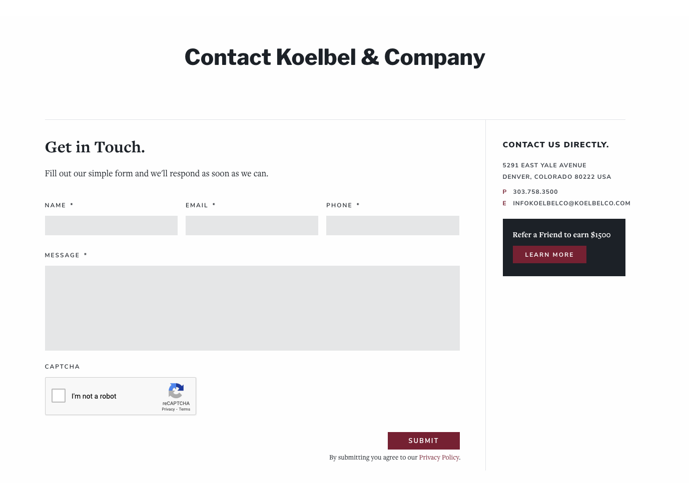
Koelbel & Company: Form Fields
Branding, Website Design & Development
Koelbel is a cornerstone of the Denver real estate market. It was important for us to dive DEEP into their brand during the strategy and research phase and to understand who they are at the core. Many different kinds of people find themselves on Koelbel’s website for a variety of reasons.
That being said, it’s only natural that people will have questions, or want to discuss a specific topic further. Form fields are extremely important in digital accessibility. Many overlook them when improving their website for digital accessibility. Placeholder text within the form fields is difficult to read, and screen readers can’t pick up on them for instruction. It’s important to leave form field submission spots blank and provide instruction on the actual page as shown here on Koelbel’s website. We also build all forms to be both keyboard and screenreader friendly.
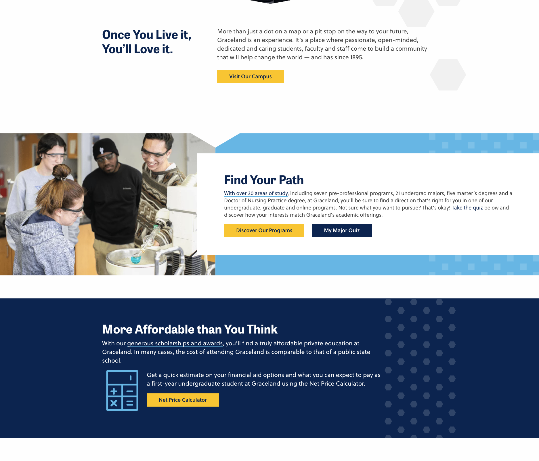
Graceland University: Color Contrast
Branding, Website Design & Development
Graceland University approached us for some help re-envisioning their website. They needed to boost their presence online and keep up with the changing ways users are consuming information online.
And again, this is for ALL users. Those with poor sensitivity to color contrasts may have a difficult time reading web pages with a lack of contrast. Same with those who have other visual impairments. Graceland University’s website is a great example of using color to help break up the page, but also ensuring text is easily readable and follows ADA-compliant color guidelines.
All Look Good?
Check and double-check.
There is so much that goes into having a digitally accessible website. So. Much. These few examples only scratch the surface, and things are always changing, so make sure you stay up-to-date on the latest rules and guidelines.
As always, feel free to reach out if you have any questions or need some help implementing digital accessibility into your web projects.
Take a look at some of our work. You should be able to see how accessibility has played a role every step of the way.
And remember, although accessibility is a standard and a law, you should do it because it’s just, fair and because you care.
To learn more about our Thrive initiatives, download and view this document.